
AuthorRichard Beavis
LinkedIn
Why are header navigations important for user experience?
User experience tops the priority list for eCommerce sites as it helps drive conversions and header navigations play a key role in that. Header navigations are a way of directing users to the pages they want as efficiently as possible. They should contain all the signposts a user might need to quickly access key landing pages. Simplicity for the user should always be a key feature of any header navigation.
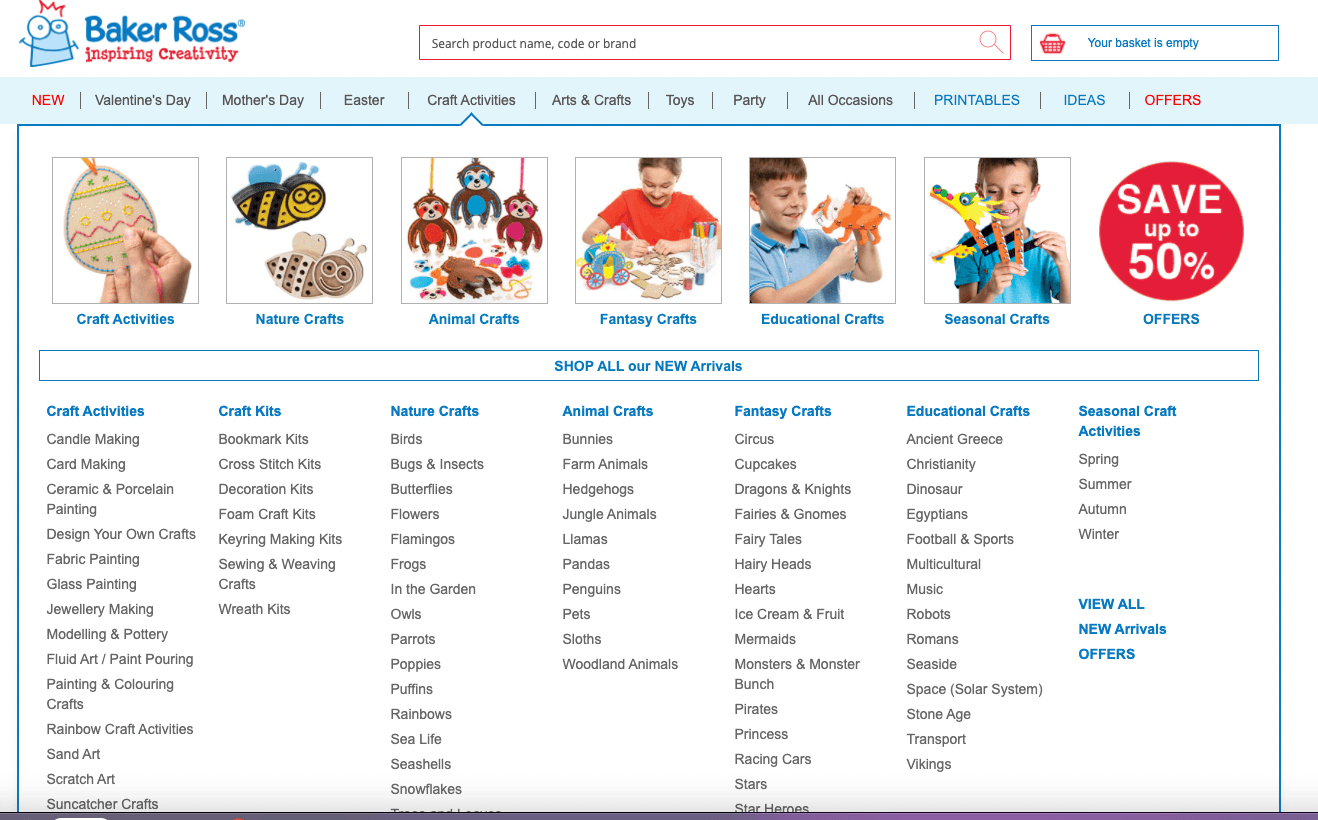
Here’s a great example from the innovative eCom startup, Swyft, that sells modern sofas and furniture. Check out their header navigations
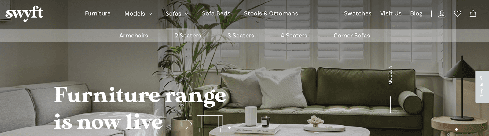
Here’s what’s good about their navigation
- The navigation contains only relevant priority category pages. It is lean and easy to navigate for both users and search engines
- The navigation uses a combination of keyword research data, search intent and business priorities to establish a logical header navigation
- The anchor texts are relevant to the user, and targeting high search volume keywords
- The user experience is considered throughout
- There are no external links in the header navigation
- There are no links to 301s and 404s in current header navigation
Why are header navigations important for SEO?
It’s not only to help the users, the header navigation is also supremely important for SEO.
In terms of SEO, header navigations play a large role in how search engines prioritize content and pages to display in the search results. For example, a page that is linked to in a header navigation is more likely to rank well in the search results, compared to a page that is not in the header navigation, all else being equal. This is because the header navigation:
- Sits on the top of every page across the site
- Is often crawled first, before other content
- Can dictate bounce rates on a site, which can be a ranking factor
- Determines the link equity flow on a site
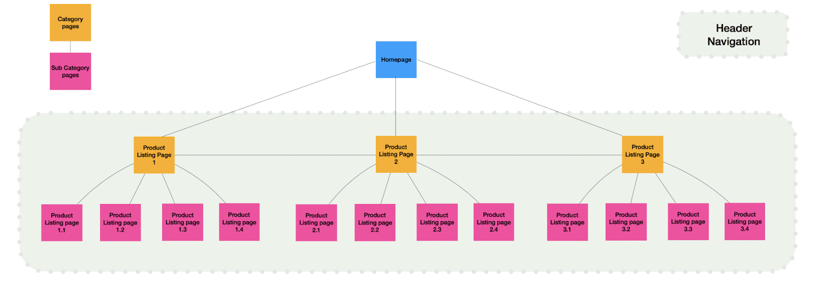
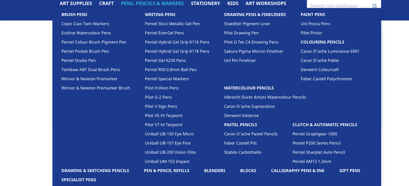
Here’s what a well-structured header navigation looks like:
Top tips to create header navigations for eCommerce sites
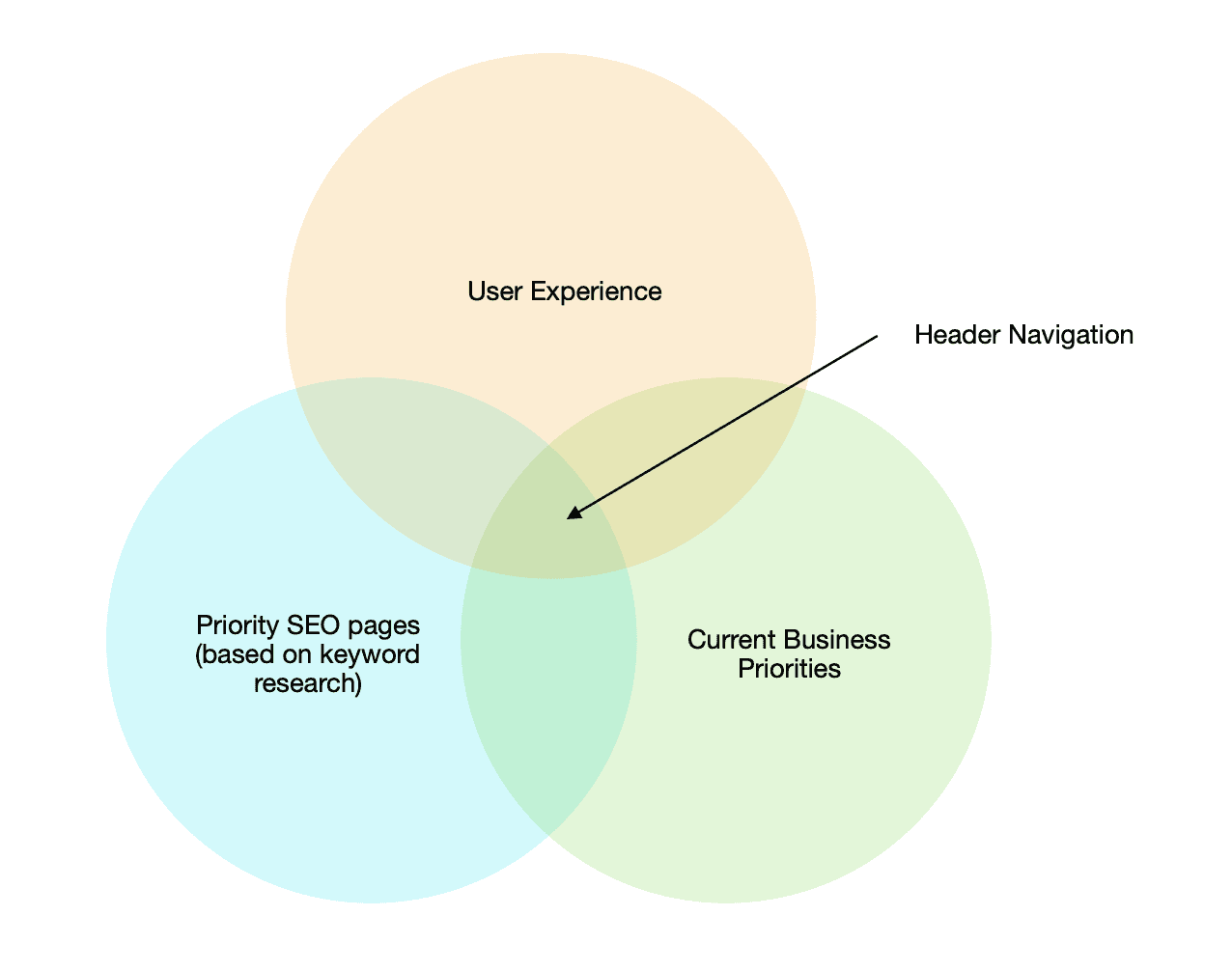
Below are some tips on creating an E-commerce site header navigation, with some examples and diagrams to help illustrate these tips. The process follows this structure:
- Complete Keyword Research to understand which category pages should be included in the navigation based on demand
- Ensure these category pages align with the business priorities for the site
- Consider how the user experience will improve compared to the current header navigation
- Create a prototype navigation, choose the correct HTML implementation and send it to developers.
Here is a way of illustrating how a header navigation should be created:
Understanding which pages to include in the header navigation
First, it is best to understand which pages search engines are prioritizing. Using Botify’s internal PR score or Screaming Frogs Link score can give an indication of which pages search engines view as priority pages. From this, it can be determined which category pages need to be included in the header navigation/are currently missing.
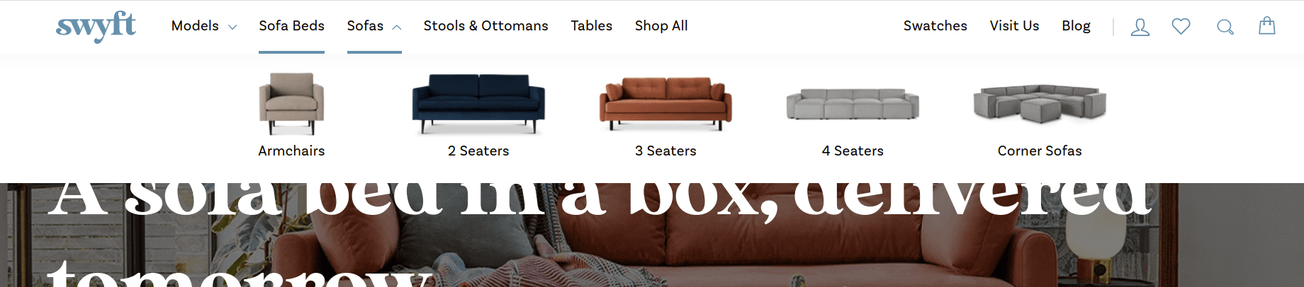
Keyword research is key: Complete a full keyword research document to understand the search volumes for products on the eCommerce site. Use these to find patterns/groupings in the data, which can show which category pages are a priority. Be sure to include the correct anchor texts based on the keyword research. Ideally, a small/medium-sized site would want 3-6 category pages to prioritise, with 3-6 subcategories in each category:
For example, see how Swyft categorises its product offering and the category “Sofas” has 5 subcategories such as armchairs, 2 seaters, 3 seaters 4 seaters and corner sofas.
Don’t forget to consider Google trends if your business is seasonal, as you might want to add and remove pages to the navigation where necessary such as a Christmas page.
Considering the businesses priorities
It can be tempting sometimes, especially when deep diving into search volumes and rankings, to fill the header navigation with a large number of categories and sub categories to target a wide range of keywords.
When designing a header navigation from an SEO perspective, the client’s business priorities must be considered and included in the header navigation. Often there is compromise needed from both sides here. However, the importance of this should not be underestimated for a number of reasons:
- Considering a client’s business priorities in the header navigation allows the client to be more invested when redesigning a header navigation. This can help with developers and actions further down the line.
- Often, the clients business priorities are similar to key SEO landing pages, and it will reflect what they have in stock. Therefore it is a good way to check that all key category pages are included in the proposed header navigation.
Therefore, as best practice, SEO friendly header navigation should usually include business priorities from the perspective of the client too. One circumstance where this might not be true is if there are too many business priorities which would result in a bloated header navigation, such as these below.
[This header navigation is cut off halfway on the desktop due to an overload of header links]
[This header is hard for the user to quickly spot a section/category that is relevant to them. Also, it includes multiple keywords that have 0 searches a month]
User experience
The user experience should always be at the forefront of any header navigation strategy. A navigation that is either too bloated or too lean can cause multiple issues:
- Users unable to easily find the product that they originally searched for on Google – this can cause high bounce rates which is often considered a ranking signal
- Potential brand reputation decrease for users who feel that they have wasted time as they were unable to find the product they want
- Organic search is very competitive, it is easy for users to return to the Search engine results pages and choose a competitor
- Users are less likely overall to make a purchase
Therefore, for these reasons user experience is the most important aspect of header navigations. Usually, it is quite clear to the eye when user experience is compromised, but typically if a user has to click through more than two levels to find the product they want then a header navigation is not optimised for the user.
As mentioned before, for a small or medium-sized website a header navigation should rarely have more links to pages than this: 3-6 category pages to prioritise, with 3-6 subcategories in each category.
This roughly should be a maximum of 36 links to product landing pages in the header navigation, set out in a logical way with drop-down menus where sub categories are included.
Depending on the nature of the site, more or fewer links might be required. For example, large eCommerce sites such as John Lewis will have more than this in the header navigation. However, in general, 3-6 category pages with 3-6 sub categories as a drop down menu under each category is a good template for header navigation.
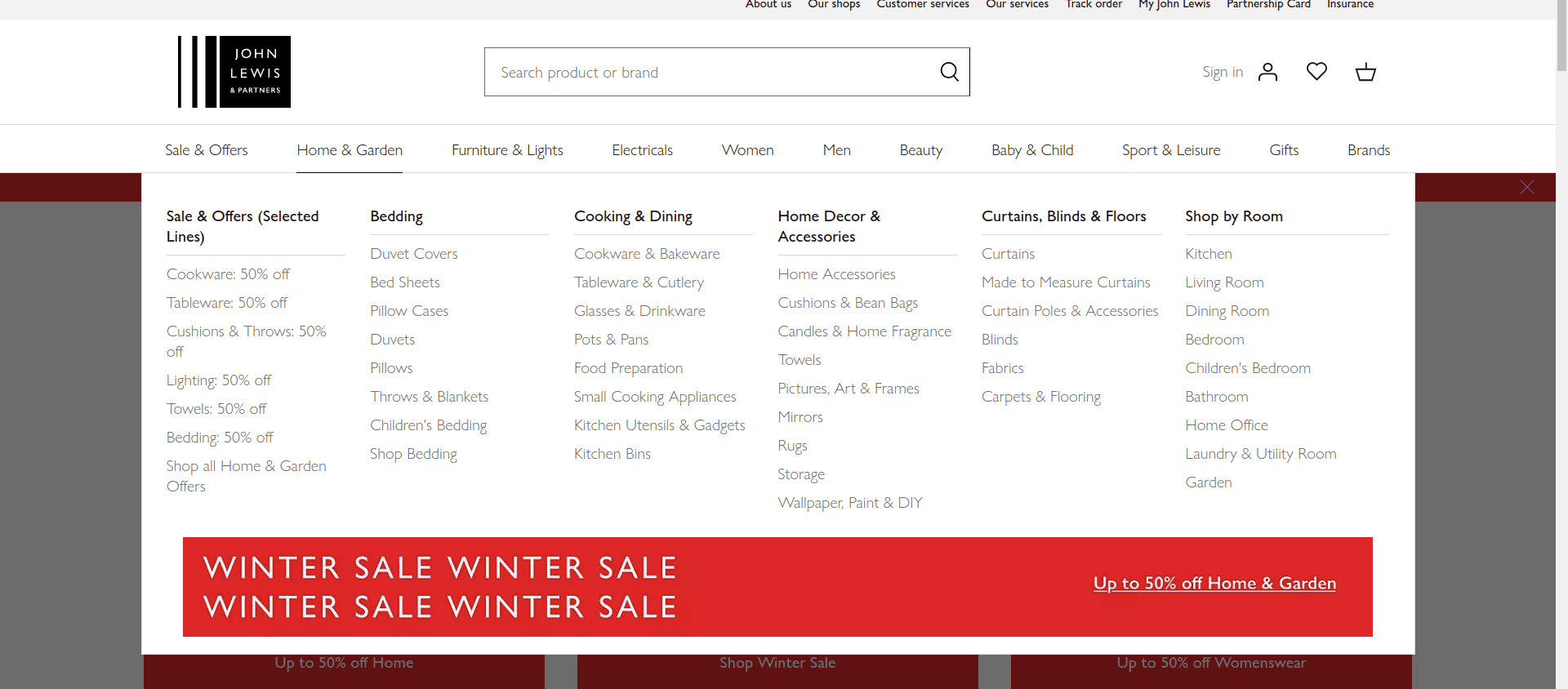
[See how John Lewis website has several categories and subcategories in their header navigation]
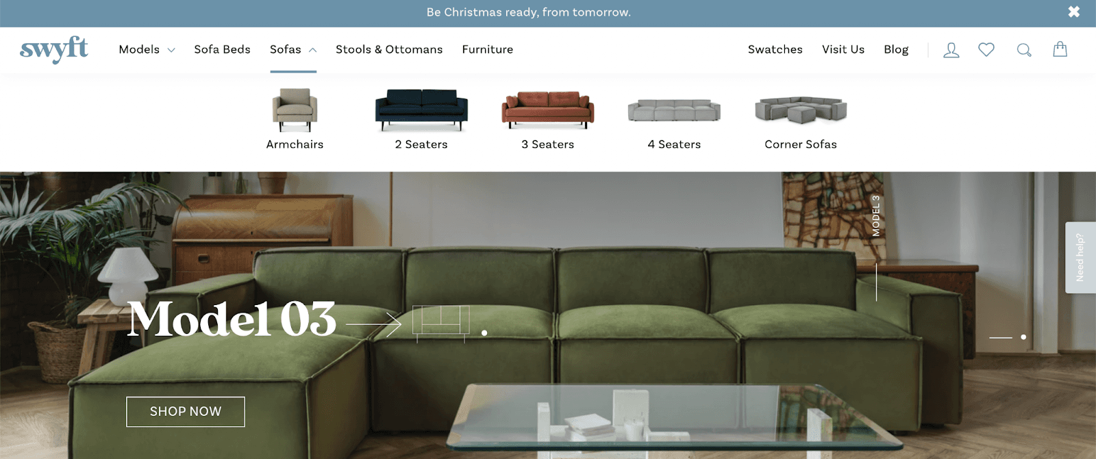
[In comparison, Swyft has fewer categories and subcategories]
Measuring the impact of improved header navigations
Three ways to measure the output of improved header navigations from a user experience perspective is to monitor:
- Pages per session data
- Bounce rates
- Exit pages
HTML Header Navigations
HTML header navigations are the common approach in SEO, especially when designing a simple, crawlable header navigation. The simple recommendation is to ensure all key category and sub category links in the header navigation are in HTML format. Google can easily crawl these links, and the anchor texts are also easy to read for search engines.
An example of the crawling and rendering process:
Creating a prototype
It is crucial to communicate what the header navigation should include. Often, this can get lost in translation when sent over to developers. Therefore, it is important to clearly design a prototype header navigation. Typically there are two stages
- Using Miro or other drawing tools, design a prototype using nodes or a logical structure to create a diagram.At this point, client approval is needed and it is best practice to run through the proposed navigation.
- If needed, for example with larger sites, design a live prototype that can be shared with developers. Axure is a good tool for this.
Summary:
- Never “bloat” a navigation” – keep it lean and easy to navigate for both users and search engines
- Use a combination of keyword research data, intent and business priorities to establish a logical header navigation.
- Consider anchor texts when creating the header navigation
- Ensure user experience is at the forefront of any header navigation design.
- Never have external links in the header navigation
- Always check for links to 301s and 404s in current header navigations